This page presents some typical graphics made in the community,
that only requires a few lines of codes thanks to the
ssoBFT.
It illustrates how SsODNet
can help you in accessing and displaying data for your research.
For each use case, we provide a Python
code snippet (prerequisites:
rocks,
matplotlib, and
numpy)
and a TOPCAT/STILTS
script snippet (prerequisites: the script and the
ssoBFT parquet file
must be downloaded to the same directory) that allow you to reproduce the graphs.
Download all the code snippets in a single archive, for
Python and
TOPCAT.
Dynamical classes
A simple view of the inner Solar system seen from above, color-coded by dynamical classes.
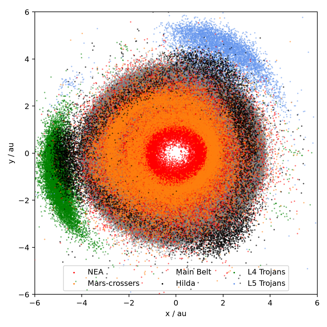
Conceptually, we read the ssoBFT, chose a few
dynamical classes,
find the corresponding rows, and plot their (x,y) positions:
import rocks
import matplotlib.pyplot as plt

bft = rocks.load_bft(columns=["class", "position"])

fig, ax = plt.subplots()
for cl in ["NEA", "Mars", "MB", "L4", "L5"]:
    cond = bft["class"].str.contains(cl)
    ax.scatter(
        bft.loc[cond, "position"].str[0],
        bft.loc[cond, "position"].str[1],
        label=c,
    )
ax.set_xlim(-6, 6)
ax.set_ylim(-6, 6)
You may notice how we load two columns only from the ssoBFT
to make the code faster.
The figure on the left requires a few additional lines of code to define the axis labels,
colors, etc., but these are merely aesthetic elements.
Download the scripts:
Python
;
TOPCAT
Distribution of albedo in the Asteroid Belt
The distribution of albedo in the asteroid belt, shown in proper elements.
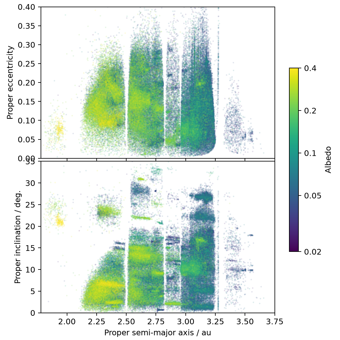
Conceptually, we read the ssoBFT, choose the
dynamical classes corresponding to the belt,
and plot (a,e) and (a,i) color-coded by the albedo:
import rocks
import numpy as np
import matplotlib.pyplot as plt

bft = rocks.load_bft()

cond = ( (bft["albedo.value"].notna()) &
    (bft["class"].str.contains("MB"))

fig, ax = plt.subplots(2,1)
ax[0].scatter(
    bft.loc[cond,"proper_elements.proper_semi_major_axis.value"],
    bft.loc[cond,"proper_elements.proper_eccentricity.value"],
    c=bft.loc[cond,"albedo.value"]
)

ax[1].scatter(
    bft.loc[cond,"proper_elements.proper_semi_major_axis.value"],
    bft.loc[cond,"proper_elements.proper_inclination.value"],
    c=bft.loc[cond,"albedo.value"]
)

fig.colorbar(label="Albedo")
ax[0].set_xlim(1.78, 3.75)
ax[0].set_ylim(0, 0.4)
ax[1].set_ylim(0, 35)
The figure on the left requires a few additional lines of code to define the axis labels,
colors, etc., but these are merely aesthetic elements.
Download the scripts:
Python
;
TOPCAT
Source regions of Near-Earth Asteroids
The probability of coming from a given source region (here only Hungaria and 3:1 mean-motion
resonance) for Near-Earth Asteroids.
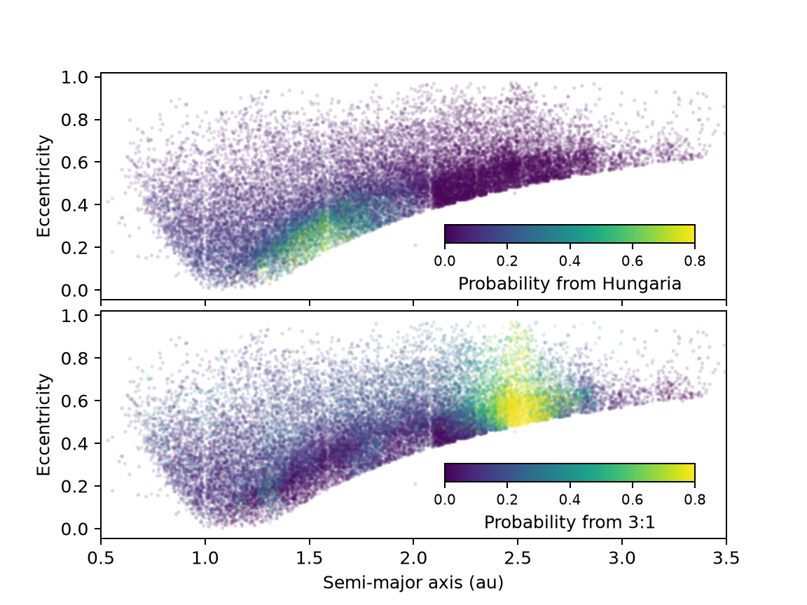
Conceptually, we read the ssoBFT, choose the
NEAs and plot their (a,e) distribution color-coded by the source region probability:
import rocks
import matplotlib.pyplot as plt

bft = rocks.load_bft(full=True)

cond = (bft["class"].str.contains("NEA"))

fig, ax = plt.subplots(2,1, sharex=True)
ax[0].scatter(
    bft.loc[cond,"orbital_elements.semi_major_axis.value"],
    bft.loc[cond,"orbital_elements.eccentricity.value"],
    c=bft.loc[cond,"source_regions.hun.value"]
)

ax[1].scatter(
    bft.loc[cond,"orbital_elements.semi_major_axis.value"],
    bft.loc[cond,"orbital_elements.eccentricity.value"],
    c=bft.loc[cond,"source_regions.mm31.value"]
)

fig.colorbar(label="Source region probability")
ax[0].set_xlim(0.5, 3.5)
The figure on the left requires a few additional lines of code to define the axis labels,
colors, etc., but these are merely aesthetic elements.
Download the scripts
Python
;
TOPCAT
Average albedo of taxonomic classes
The distribution of albedo for three taxonomic classes: C, S, and M.
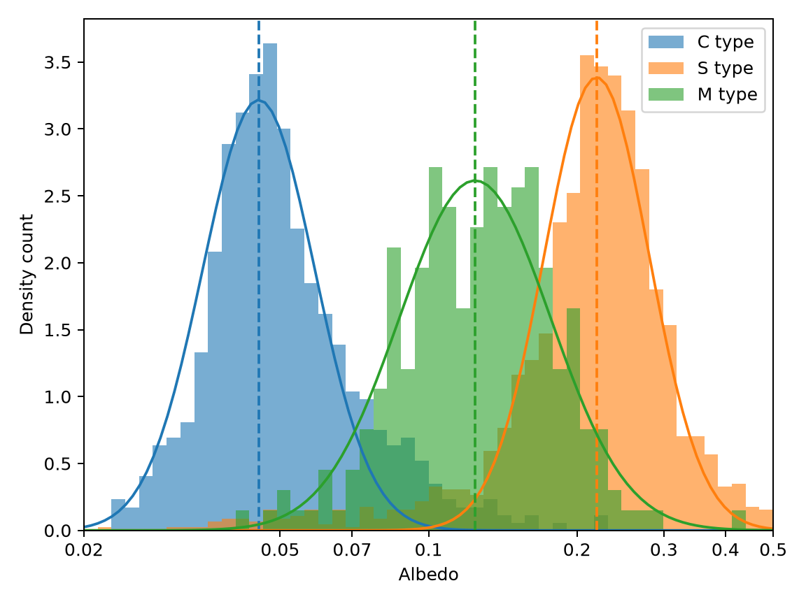
Conceptually, we read the ssoBFT, identify objects
which taxonomy is either C, S, or M,
as determined by spectroscopy, plot the histogram of albedo, and fit Gaussians:
import rocks
import matplotlib.pyplot as plt

bft = rocks.load_bft()

fig, ax = plt.subplots()
for cl in enumerate(['C','S','M']):
    cond = (bft['taxonomy.complex']==cl) & (bft['taxonomy.technique']=='Spec')
    ax.hist( bft['albedo.value']), label=f'{cl} type')

ax.legend()
ax.set_xlabel('Albedo')
The figure on the left requires a few additional lines of code to define the axis labels,
colors, etc., but these are merely aesthetic elements.
Download the scripts:
Python
;
TOPCAT
Rotation period against diameter
The distribution of rotation period vs diameter, highlighting binary systems.
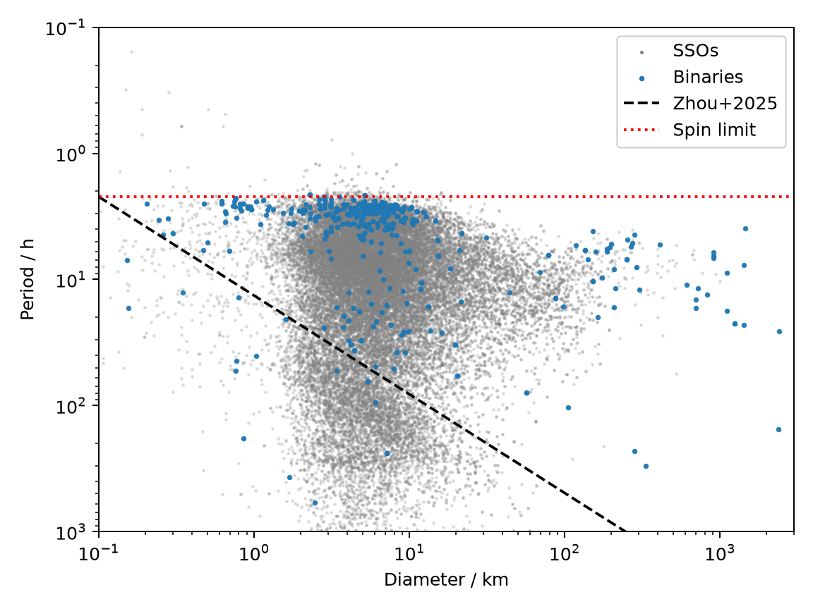
Conceptually, we read the ssoBFT and
simply plot the rotation period agains the diameter. We then overplot binaries
(SSOs with children):
import rocks
import matplotlib.pyplot as plt

bft = rocks.load_bft(columns=['diameter.value', 'spins.period.value'])

df = bft.explode("spins.period.value")

fig, ax = plt.subplots()
ax.scatter(
    df["diameter.value"],
    df["spins.period.value"],
)

cond = df["children"] > 0
ax.scatter(
    df.loc[cond, "diameter.value"],
    df.loc[cond, "spins.period.value"],
)
ax.set_xscale("log")
ax.set_yscale("log")
ax.invert_yaxis()
The figure on the left requires a few additional lines of code to define the axis labels,
colors, etc., but these are merely aesthetic elements.
Download the scripts:
Python
;
TOPCAT
Phase parameters as function of taxonomy
The distribution of G1 and G2 phase parameters for different taxonomic classes.
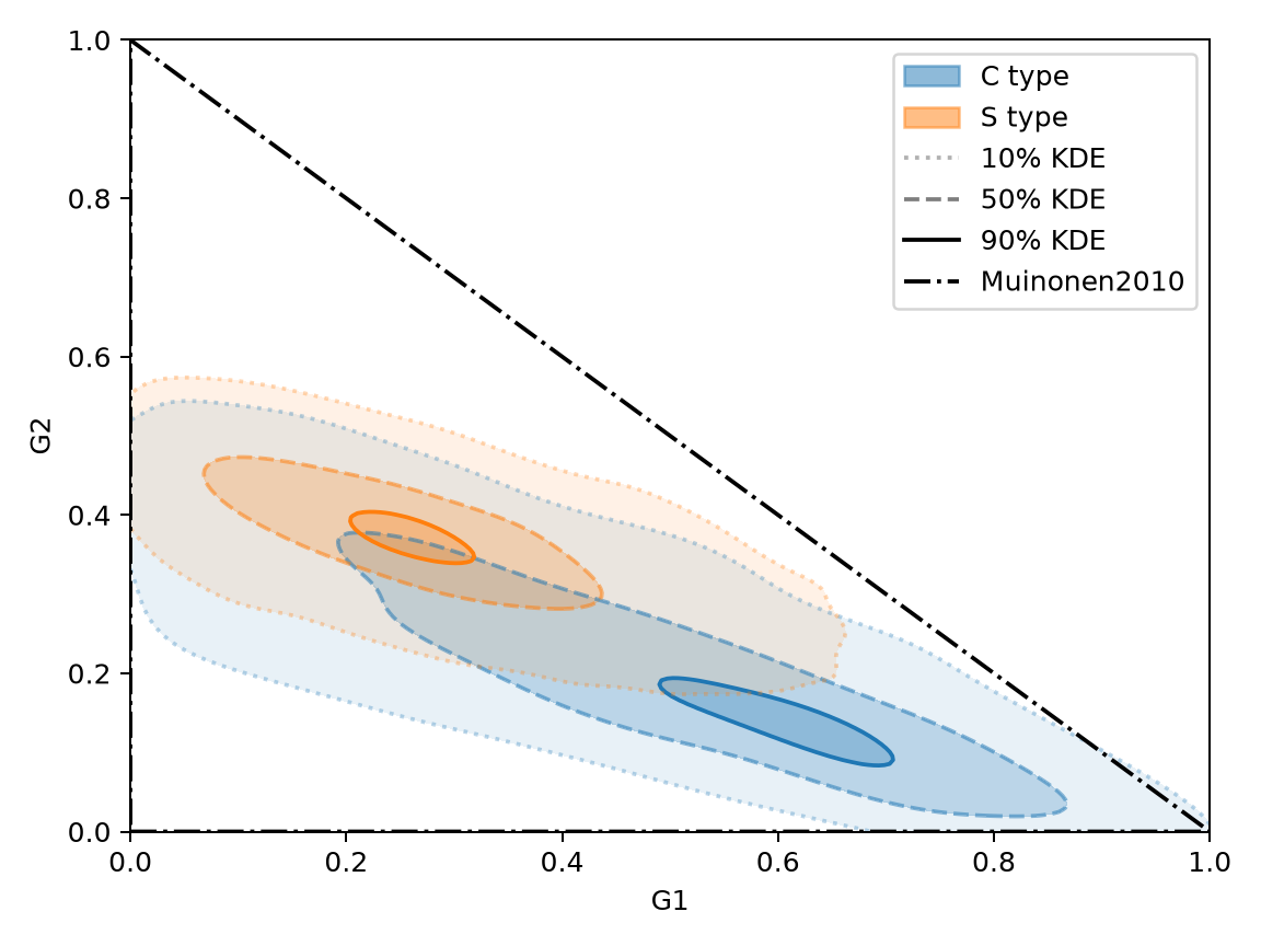
Conceptually, we read the ssoBFT,
explode the columns for phase functions (they are arrays),
select Palomar/ZTF.r filter, and
simply plot the G1 and G2 parameters for C and S taxonomic classes:
import rocks
import matplotlib.pyplot as plt

bft = rocks.load_bft(full=True)

cond = bft["phase_functions.G1.value"].notna()
df = bft[cond].explode(
    [
        "phase_functions.id_filter",
        "phase_functions.G1.value",
        "phase_functions.G2.value",
    ]
)

fig, ax = plt.subplots()
cond_ZTFr = df["phase_functions.id_filter"] == "Palomar/ZTF.r"
for cl, color in zip(["C", "S"], ["C0", "C1"]):

    cond = cond_ZTFr & (df["taxonomy.class"] == cl)
    ax.scatter(
        df.loc[cond, "phase_functions.G1.value"],
        df.loc[cond, "phase_functions.G2.value"],
        s=1, alpha=0.5,
        label=cl
    )

ax.legend(loc="upper right")
ax.set_xlabel("G1")
ax.set_ylabel("G2")
The figure on the left requires a few additional lines of code to define the axis labels,
colors, etc., but these are merely aesthetic elements.
Download the scripts:
Python
;
TOPCAT
Distribution of obliquity as function of diameter
The distribution of obliquity (angle between the rotation axis and the orbital plane) as function of diameter.
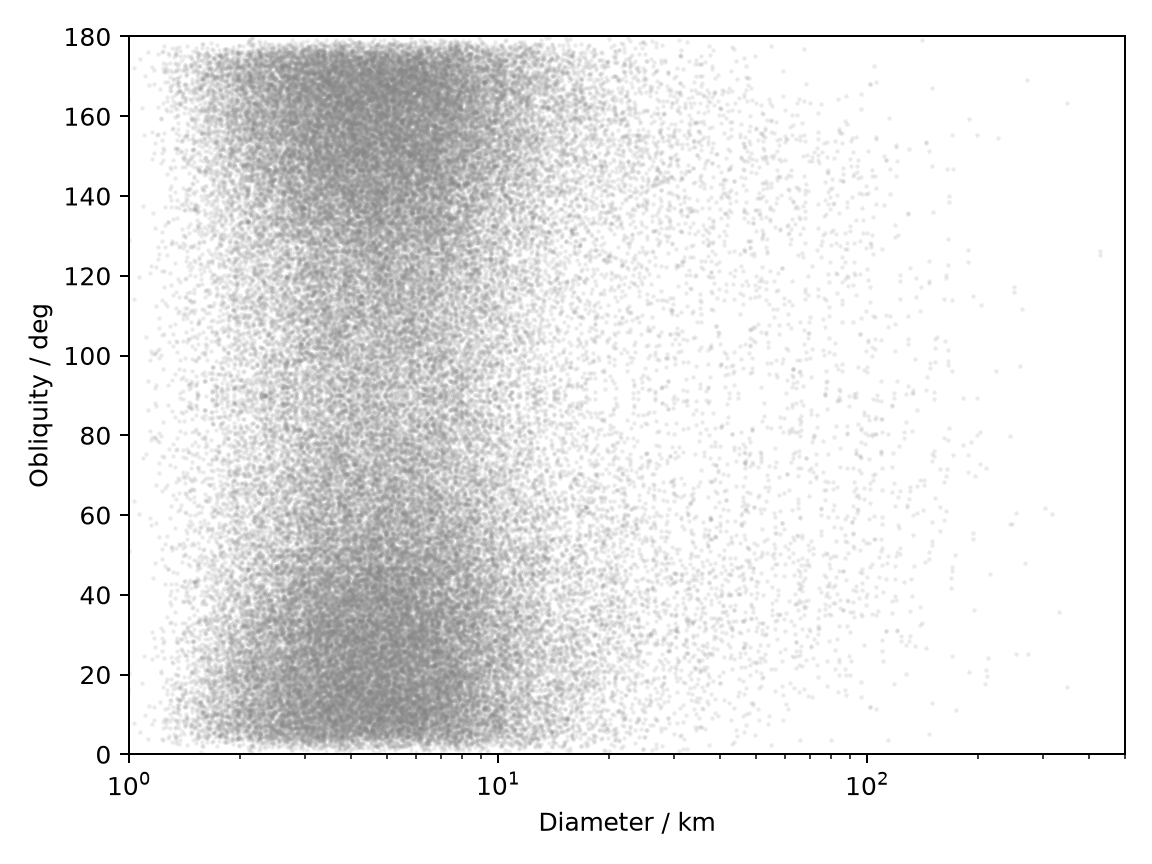
Conceptually, we read the ssoBFT,
explode the columns for obliquity (it is an array),
simply plot the obliquity as function of diameter:
import rocks
import matplotlib.pyplot as plt

bft = rocks.load_bft(columns=["diameter.value", "spins.obliquity.value"])
df = bft.explode("spins.obliquity.value")

fig, ax = plt.subplots()
ax.scatter(
    df["diameter.value"],
    df["spins.obliquity.value"],
    s=1,
    alpha=0.1,
    color="grey",
    label="SSOs",
)

ax.set_xscale("log")
ax.set_xlim(1, 500)
ax.set_ylim(0,180)

ax.set_xlabel("Diameter / km")
ax.set_ylabel("Obliquity / deg")
The figure on the left requires a few additional lines of code to define the axis labels,
colors, etc., but these are merely aesthetic elements.
Download the scripts:
Python
;
TOPCAT